The Three Soprafinos

Tarocchino Lombardo, the long out-of-print soprafino deck published by Il Solleone, fell into my hands recently. This gave me an opportunity to compare it with soprafino facsimiles by Lo Scarabeo and Il Meneghello. The the cards in the illustrations from left to right are: Lo Scarabeo, Il Solleone, Il Meneghello.
If you need a refresher on this deck style, here’s a page with everything you need to know.
The short version: About 1835, the printing house of Gumppenberg in Milan hired the artist Carlo Della Rocca to create an exquisitely beautiful engraved tarocchi deck. Since then, many of the deck’s unique design elements have been used in other decks printed in Lombardy and Piedmont.
Here’s a run-down of the features of each deck:
Il Meneghello
This is the real deal — a facsimile of the deck as it looks now complete with age marks and stains. A thin white line runs along the right edge where it appears the card was not centered exactly on its backing. The card stock is smooth and sturdy. Card backs are printed with subtle dots and circles in gray on cream. Card size: 2 millimeters shorter than the Il Solleone
Il Solleone/Bordoni
This is a facsimile of a soprafino knock-off printed by Bordoni of Milan in1889. The lines are nearly identical to the Gumppenberg original, but close examination shows subtle differences.
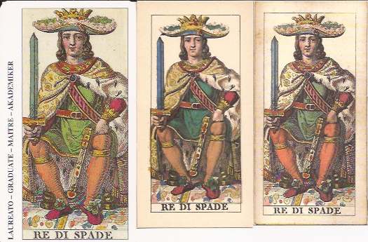 The colors are rich and deep – sometimes so dark they obscure the details. Ink, especially the red, slops over the lines. You don’t see this in the other two decks, but it’s not nearly as bad as many stenciled decks. The intense sapphire blue is unique to this deck. It’s found on the Fool’s pants, the Star card’s water, and the sword blades of the ace and court cards of the swords suit. A few cards have minor cropping: The Fool card lost part of the dog’s front leg and the Fool’s bag. The background is cream with no staining. The publisher either worked from a pristine copy or cleaned the cards up.
A few images differ from Della Rocca’s original: The Ace Coins has a Mercury head instead of a woman. The King Rods holds what I can only describe as a pizza pan enclosing a white shield with a red cross.
I especially like the faces on the court cards. I’ve never liked the soprafino faces with their sickly pale skin and artificial pink spots on the cheeks. In this deck, the skin is a healthy flesh color and the faces look more real and robust. But for some reason, color has been omitted on the lips of some court figures. The Queen of Batons looks especially haggard.
The card backs have the Il Solleone logo of a sun and a crowned lion. Card size: 2.25 x 4.3 inches (5.75 x 11 centimeters.)
Lo Scarabeo
This deck is a bit larger than other two, and the colors are brighter, which makes it easier to see details and lines. The cards have a wider right margin with the card name in four languages, as in so many Lo Scarabeo decks. The background has light speckling and faint discoloration, but it doesn’t match the stains on the Il Meneghello deck. It seems Lo Scarabeo cleaned up the original stains then attempted to give the cards an aged look. Card stock is the same as most commercial decks.
Card backs show the Star card printed upright and reversed in sepia. Card size: 2.5 x 4.75 inches (6.5 by 12 centimeters).
Which deck to get if you can only have one.
 Il Meneghello is the most historically accurate but not the most aesthetic, in my opinion.
Lo Scarabeo seems to be identical to Il Meneghello with more subtle stains. It’s best for studying details. The borders ruin it aesthetically, but if you can ignore them, it’s a good, inexpensive deck for shuffling.
Il Solleoni/Bordoni: If I were going to read with a soprafino, I’d use this deck. It feels good in the hand, is sturdy, has strong colors, and is aesthetically pleasing. It’s the kind of deck I would have owned if I had lived in the 19th century.
Deck information
Tarocchino Lombardo inciso da Carlo Dellarocca, Milano, @1835. Edizioni del Solleone, a cura de Vito Arienti, Lissone, Italia, 1981. 2,500 printed. (Facsimile of a deck printed by Bordoni, Milan, 1889)
Classical Tarots, Lo Scarabeo, Torino, Italy, 1999. Still in print.
Tarocco Soprafino di F. Gumppenberg, Milano 1835. Edizioni Il Meneghello, Milano 1992. 2,000 printed.
Links
Here’s the article again about the Soprafino style
Here’s an article about another soprafino variant originally published by the Avondo Brothers and reprinted by Lo Scarabeo.


Stunning!
Thank you!
Thank you for this. If I ever win the lottery, I’ll buy everything from Il Meneghello. In the meantime, the Lo Scarabeo versions satisfy me. My edition doesn’t have those borders (you can see here: http://bit.ly/1GBi0nx), but if it did, I would trim it, as I’ve done with the Tarot of the Master (Vacchetta).
I haven’t had the nerve to do a borderectomy on any of my decks, although Lo Scarabeo’s decks certainly beg for that treatment. If I won the lottery I’d get all of Il Meneghello’s mini decks. His tiny Soprafino is exquisite.
I just came across this website and I´m amazed, there is so much information, and of such a high level of quality that I don´t know where to start reading.
I just want to thank you for this amazing job. I love history of Tarot.
Greetings from Argentina!!
Daniela, thank you so much for your encouraging comment. I hope you find a lot here that’s useful. Happy reading!
I bought the brown box edition and got a copy with white edges. I think this deck looks darker, dirty. How come all the videos of the brown box version do not have the white lines at all and even with the ink stains the video images show clean bright colors?
How cone all the videos of the brown box soprafino do NOT feature the white line. I received a copy I purchased today and it hD the white line on the side and was dirty and dull looking. Not talking about the ink staining. The videos I have seen review this brown box deck are bright and clean even with the staining and NONE have the white line. I am Frustrated and confused. And there is a silver box version as well.
Lisa, I’m so sorry you’re not happy with your deck. I’m not sure what you mean by the “brown box edition” since both the Solleone and Il Meneghello decks come in brown boxes. But I assume you mean Il Meneghello. I just looked at my deck again, and all the cards have the white border down the right side. It’s my guess that the card front was pasted onto a white backing paper and it was not trimmed closely enough on the right side before reproduction. It is a bit disappointing, since one would expect Il Meneghello to pay better attention to detail. The cards are a bit grubby looking. That’s because it’s a facsimile created from photographs of the cards as they exist today, with all their ageing and oxidation. The Solleone cards are a facsimile of a later edition printed by Bordoni so they are not as aged. And I suspect the folks at Solleone cleaned the appearance up a bit.
I can’t really explain why the decks you’ve seen in videos are different. But here’s a guess. I’ve come across examples of Il Meneghello printing their decks in batches over time and using different boxes. My deck is number 210 out of 2000. If yours has a low number as well, then I think we have decks from an early print run. In later print batches they corrected the white border and brightened the deck overall. Just a theory on my part.