I Tarocchi Marco Benedetti: An Homage to the Visconti-Sforza Deck

I came across this deck on The Gamecrafter while looking for something else and was immediately taken by the graceful, clean lines and minimalist design. The deck designer, Marco Benedetti, is not an artist, although he’s had architectural training, and this is the only thing he’s ever created. The deck is based closely on the Pierpont Morgan Bergamo Visconti-Sforza deck (V-S) with plenty of quirky personal touches, since it was never the creator’s intention to simply redraw the V-S deck.
Benedetti’s goal was to return to the roots of tarot and strip it of the extraneous occult symbols that had been laid on over the centuries. He believes that any symbolism should be implicit in the overall design, so he made his drawings simple and ambiguous to keep the viewer’s imagination from being imprisoned by specific images.
 I rarely buy decks just for their aesthetic appeal. The voice in my head always says, “It’s nice but can you read with it?” The answer here is a resounding “yes.” In fact, I find it easier to read with than the 15th-century original. The court cards are my favorite part of the deck. They’re based very closely on the V-S originals, but stripped down to their essential gesture: The Page of Batons stands and waits, the Knight of Cups comes forward and offers, the King of Swords sits defensively.
As in all historic decks, the aces are elaborate, while Benedetti has stripped the pip 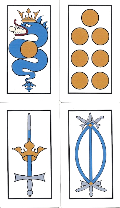 symbols to the essential. I asked him why the swords look like TdM pips rather than being straight as in the original V-S deck. I only know European playing cards from studying historic decks, while he’s a native Italian who’s been playing cards since he was a child. In his world, swords with curved scimitars on playing cards seem normal, while straight swords seem peculiar. Then there’s the historic precedent of the Brambilla deck commissioned by the Duke of Milan @1442. Rather than being true to the V-S original, Benedetti went with the design that felt natural to an Italian card player.
This deck is available at The Gamecrafter (see link at bottom). It’s 2.75 x 4.75 inches printed on sturdy card stock with a smooth finish that makes the cards very easy to shuffle. The backs are solid dark red. The tuck box is the same dark red with the title card (Two of Cups) printed on one side, and the Ace of Coins on the back side.
Evolution of the Deck
In 1975, Benedetti encountered Italo Calvino’s novel The Castle of Crossed Destinies and was spellbound by the Visconti-Sforza card on the cover. A few days later he purchased a copy of the deck printed by Monumentale Longobarda. This deck has been his go-to deck and primary reference ever since.
Starting in 1989, he spent two years creating black and white cards – many of them traced from the V-S deck and incorporating some Ferrarese imagery. Once he assembled the cards into an actual deck, he realized it didn’t work for him and he couldn’t read with it.
 During a trip to New York City in 1992, he became one of the blessed few who have been invited for a private viewing of the V-S deck in a back room of the Morgan Library. It was then he realized the secret to the cards’ magic is the gold foil.
A friend organized a show of original tarot art in 1996 and invited Benedetti to participate. He created a 78-card deck the same size as the original using Bonifacio Bembo’s 15th-century technique of tempera paint over gold and silver leaf, painstakingly applied by hand to cardboard. He also created twenty-two over-sized trumps which he framed and entered into the 1996 exhibit. The Hermit shown here is an example of how genuine gold gives a heavenly glow to the cards. I’m rather amazed that Benedetti actually shuffles and reads with his one-of-a-kind gold deck. He applied the gold leaf to a red background, so if the gold wears off from shuffling, the red will show through just like it does in the worn V-S cards. But Benedetti had access to a paint fixative unknown to Bembo so the cards are holding up well with daily shuffling.
When people started asking for decks, he put the first version up for sale on The Gamecrafter in 2014. This deck has been modified in 2016 and 2019.
A Disclaimer and My Own Gold Deck
 I have to confess that I’m not entirely objective about this deck. I exchanged numerous emails with Benedetti in early 2019 while he made his latest revisions. I critiqued drafts of his updated cards and we had many discussions about what historic cards to use as models for his designs.
One of our toughest discussions was the Star-Moon-Sun series. In the original V-S deck these are some of the replacement cards created in Ferrara at least 25 years after Bembo’s original deck. Benedetti rejected these as models. The cards went through versions based on the Cary Sheet and the d’Este deck, then settled on a radically different design based on the fact that two of the cards in the original V-S deck show a solitary woman holding either a star or a crescent moon. Benedetti’s cards show the heavenly body along with its associated mythic figure holding its symbolic item: Aphrodite with her dove, Artemis with her bow and Apollo with his lyre.
What about those pesky replacement cards, Devil and Tower, that most publishers get  so very wrong? I was very happy to see no anachronistic people on these cards. The Devil with his curved horns and his pitchfork at an angle reminds me of the Devil in Sullivan Hisman’s Rosenwald deck. The Tower conveys the sense of a solid structure suddenly rendered vulnerable and on the verge of destruction.
Shortly after the 2019 revisions were finished and sent to The Gamecrafter, a mysterious package from Italy arrived on 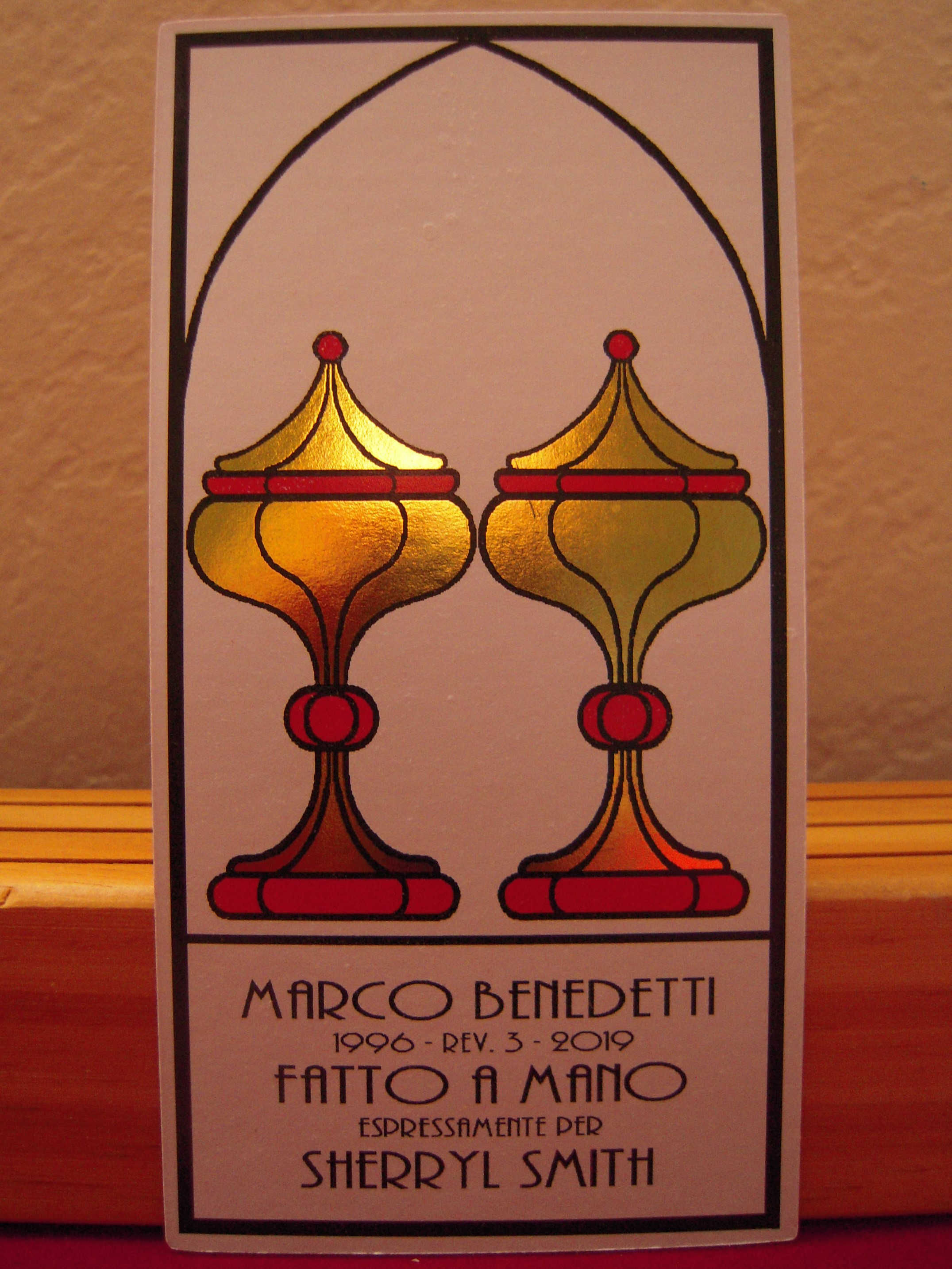 my California doorstep (amazingly, at the very moment of the Spring Equinox on a Wednesday afternoon). I was stunned to find myself the recipient of a magically beautiful gold and silver foil version of the deck, considerably larger than the Gamecrafter deck, printed on heavy card stock. And with my name on the title card, no less! It’s housed in a sturdy wood box lined with red paper, a card pasted on the cover and the spine printed in gold. This magical gift has now become the first deck I would save in an earthquake (with Sullivan Hisman’s Budapest and Rosenwald decks not far behind).
Benedetti also offers a feather-weight mini version of the deck. Cards are 2 by 3.5 inches. They are personalized and come in a box just like the larger deck. The box is made of balsa wood so cards and box have hardly any weight at all and are perfect for carrying around. I’ve shown the Death card here in both sizes.
I like to set my cards of the day, or my latest spread, in a holder where they stand upright. Then I leave them near a large window in my living room so I can watch the light play on the foil throughout the day. Sometimes the gold has an ethereal glow, other times the silver is highlighted. There are times the center of the card is emphasized and other times light sparkles around the tips of the suit symbols. Watching the cards dissolve into shimmers of light, I see that each card is one scintillating particle in tarot’s perpetually transforming energy patterns.

You, too, can have one of these magical gold and silver foil decks for your own. Just email the deck creator at Benedetti.Tarot@gmail.com to arrange for a printing.
Gamecrafter no longer handles Benedetti’s decks. Contact him directly if you are interested in a version on plain card stock without the foil.
See all the decks Benedetti offers on his facebook page
https://www.facebook.com/Marco.C.Benedetti.Tarot


Oh my, this is stunning.
Oh my, this is ugly.
Hi Pepus,
The Gamecrafter deck with the white background doesn’t do justice to Benedetti’s art. His gold versions are the treasures of my collection. Gold images at the bottom of this review and an updated version that I reviewed a year ago here https://tarot-heritage.com/2021/02/11/tarot-marco-benedetti-visconti-homage-deck/
But then, I love abstract and minimalist art, so it’s a matter of personal preference.