Three Vandenborre Decks
My 1983 Vandenborre deck by Carta Mundi has been sitting unused on a shelf for a few decades. After falling in love with Pablo Robledo’s recent production of the deck, and discovering a third version on the market at the GameofHope website, I went on a buying spree then sat down to compare the decks. All three decks faithfully recreate the lines on the original cards, but none is a photo facsimile. The stains and tax stamps have been eliminated, making each deck pristine. (There’s a link at the bottom where you can see the original cards in the British Museum.) Here’s a run-down of how the decks compare.
Colors
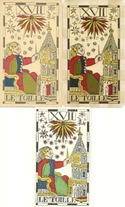
Robledo’s colors follow the originals in the British Museum exactly (bottom card in the set of three shown above). Carta Mundi’s colors are washed out and they made some arbitrary changes that remove even more color from the cards. For instance, in the Star card shown at top left, the stars have lost their red centers and there are changes to the colors at the bottom of the tower. The GameOfHope cards (top right) follow the Carta Mundi colors but are much deeper. The greens in the Carta Mundi deck appear light olive, so the GameofHope cards have dark olive; while the original and Robledo’s deck are grass green. Robledo’s cards have a white background, unlike the tan originals, making the colors pop.
Nothing in the three decks stands out as arbitrary or wrong. If we didn’t have an original deck for comparison we wouldn’t know the color had been altered. So the deck you prefer really comes down to a matter of taste.
 Size
Size
The Carta Mundi and GameOfHope cards are the same overall size, 2.75 x 4.75 inches. The actual images in the GameofHope deck are one-quarter inch shorter and narrower, but the border is larger to make up the difference. This is the only deck with rounded corners. The images in Robledo’s deck are nearly the same size as the GameofHope, but the borders are very narrow, making this the smallest deck. (The image at left gives the Robledo card an extra wide top border that doesn’t exist. The borders on all sides are about one-tenth of an inch.
Card Stock
All three decks have pleasantly smooth card stock. The front of the Carta Mundi cards is more matte and untreated than the back. This deck is by far the heaviest and stands a half-inch taller than the other decks when stacked side-by-side. The GameofHope’s playing card stock is a bit lighter than Robledo’s.
 Backs
Backs
Robledo’s deck reproduces the original sun faces in ruffled rings. Carta Mundi’s rather crude version is larger and blue. GameofHope does something different, but is still in line with historic card backs.
Packaging
The Carta Mundi box is rather flimsy. Mine is showing wear even though I rarely take the deck out. The GameofHope deck comes in a sturdy tuck box and the box and title card display an old engraving of the Spanish Captain. Robledo’s deck does not have a box. It comes in a handmade, block-printed envelope, in keeping with how decks were packaged in previous centuries. See it in my review of the deck (link below). The enclosed card gives the deck’s number and date.
The Booklet
The Carta Mundi deck comes with a stellar 30-page booklet. Its brief discussion of history is very accurate, except for calling Etteilla a hairdresser (a pet peeve of mine). The author of the booklet believes the original order of the tarot trumps appears in the Sermones de Ludo cum Aliis. This isn’t necessarily so since tarot had been around for at least a half-century before the 22 trumps were listed in the margin of the Sermones. Even though the deck is numbered in the standard Tarot de Marseille order, the booklet discusses them in the Sermones order and arranges them in three groups: those subject to Love, Death, and Eternity.
The divinatory meanings for all 78 cards stick closely to the image with no occult correspondences or metaphysical abstractions. The booklet supplies three spreads with sample readings: Oswald Wirth’s Cross Spread, and two spreads that use the 22 trumps plus the 14 cards of the suit that pertains to the question.
Recommendations
If you want historical accuracy, you want Robledo’s deck. On the other hand, although the brilliant colors on the white background are very lively they don’t have the mellow feel of the original. (Or were the cards originally white and aging turned them tan?) I’m a bit squeamish about shuffling and using a deck when there are only 29 copies in existence. Since this deck has received such high praise, surely Robledo will print more copies which will solve that problem.
I like the deep, rich colors of the GameOfHope deck and find it very pleasant to look at. But the rounded corners and the extra wide border are a big drawback. This deck really needs a borderectomy, which would pare it down to the size of Robledo’s deck.
The Carta Mundi cards are probably difficult to shuffle, although I’ve never tried. Next to the other two decks the colors look pale and lifeless; but others might see the colors as soft and delicate.
The Carta Mundi deck is long out of print, and I don’t know if it’s worth chasing down now there are more accessible decks. The deck produced by GameofHope is a good serviceable deck that will keep you going until Robledo prints more of his historically correct masterpiece.
ADDENDUM
As soon as I published this article, a reader told me about a mini Vandenborre available at www.Pyroskin.com. Unfortunately, the shipping cost to North America nearly doubled the cost of the deck. It appears to have Carta Mundi colors.
LINKS
See an original deck on the British Museum website:
These folks do reprints of several historic decks: http://gameofhopelenormand.bigcartel.com/
Collectarot carried the first edition of Robledo’s deck. If there’s a second printing it will probably be available here.
My review of Robledo’s Vandenborre deck.
My article on the Spanish Captain and some background on this type of deck.


THanks for the review, very helpful! I do love the booklet that comes with the CM edition, very unique. Looking forward to future Robledo releases!