Soprafino: Nineteenth-Century Tarot in Milan
One of the most beautiful examples of Milanese tarot landed on my doorstep a few weeks ago. Originally printed by Bordoni of Milan in 1885, it’s been reproduced by Marco Benedetti with his signature bordi rivoltinati (paper borders folded over from the back). This gorgeous deck (example on the left) led me down a rabbit hole where I pulled out all twenty of the Milanese decks in my collection and sorted through the different varieties. From the 1830s to 1890s, this distinctive tarot, with graceful lines and luscious colors, was the trademark deck of Milan and surrounding territories. It began with the Soprafino tarot printed by Ferdinand Gumppenberg about 1830 from copper plates engraved by Carlo Dellarocca. Let’s look at the origins and the evolution of this style, how it differs from the Tarot de Marseille, and the decks that are available for purchase at this time.
Gumppenberg’s Soprafino Tarot
Ferdinand Gumppenberg was born in the 1770s in Bavaria, where he served his apprenticeship as an engraver. (Most dates in this article are approximate as the records are sketchy and contradictory). Gumppenberg arrived in Milan in 1809, a few years after Napoleon crowned himself King of Italy and made Milan his capital. Napoleon established a government-owned card factory in Milan, the Reggia Fabbrica, as a money-making scheme. Gumppenberg ran this state-owned factory until 1814, when Austria became Italy’s rulers. The Austrians weren’t interested in operating a card factory, so Gumppenberg acquired it, making him the dominant Milanese card maker for the next three decades.
Gumppenberg attempted to elevate Milanese taste in printed matter and playing cards, by printing high-quality decks, like a Neoclassical tarot during Napoleon’s reign, and a deck of novelty cards depicting scenes of tradesmen at work. His greatest contribution to tarot is the exquisitely beautiful Soprafino deck, probably printed between 1830 and 1835 from copper plates engraved by Carlo Dellarocca. Up until this time, nearly all playing cards were printed from wood blocks. Only a few very special luxury decks were printed from metal plates, notably the 15th-century Sola Busca tarot, and the Mitelli Tarocchino printed about 1660 in Bologna. Copper engraving allows for fine detail and graceful, flowing lines. The Gumppenberg/Dellarocca deck’s generic name is Tarocco Lombarda or Tarocco Milanese. But, since it was the most beautiful tarot anyone had ever seen, it came to be known as the Soprafino tarot.
The original black and white drawings for the deck, by an unknown artist, reside in the British Museum. The date we attribute to the deck’s creation depends on how long Gumppenberg and Dellarocca lived. The tax stamp on the Ace of Coins was valid from 1823 to 1840, giving us a window of time. We have several death dates on record for both Gumppenberg and Dellarocca in the 1820s, 30s and 40s. The deck is usually dated to 1830 or 1835.
Currently there are three faithful reproductions of the original Dellarocca deck that I know of:
In 1992, Il Meneghello produced 2,000 copies of a photo facsimile. This is the only unretouched version I know of, showing stains and ageing. The Hanged Man card is in worse shape than most. The cards are the original size.
The middle card is from Lo Scarabeo’s Anima Antiqua series, printed in 2020. The Lovers and Sun cards shown above are also from this deck. Titled Tarocco Sopraffino, the size and the colors are nearly identical to Il Meneghello’s cards.
Lo Scarabeo produced a Soprafino in 2000 they named Classical Tarots. The cards are considerably larger, and the colors are deeper and more intense than the Anima Antiqua version, making the details easier to see. The cards have wide left borders with a divinatory keyword in four languages.
Soprafino Imagery
Soprafino’s unique card images set the tone for the Milanese/Lombardy style that was very popular for the rest of the century. Here are some examples illustrated with the Anima Antiqua deck:
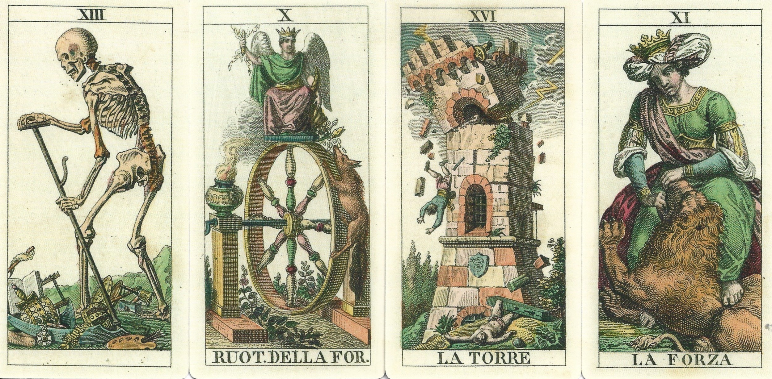
Rather than skulls and body parts, the Grim Reaper sweeps up jewelry, military medals, crowns, books, builder’s tools, and art supplies. This is a type of Vanitas image – commenting on the futility of piling up stuff during your lifetime.
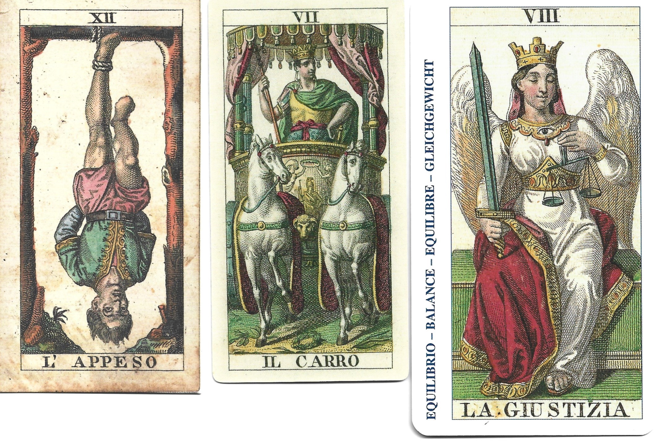
Jupiter sits on top of the Wheel of Fortune, a thunderbolt in one hand, while the other hand dispenses good things from a cornucopia. A greedy fox scrambles up the side of the wheel, eager to lap up what the god dispenses. He may be dispensing the same things the Grim Reaper is sweeping away. Smoke from an incense offering drifts up toward Jupiter.
The militaristic Tower reflects the turbulent mid-nineteenth century, when resentment of foreign rule was about to boil over into armed rebellion. A cannon sits on top of the tower that’s about to collapse. A little person peeks out of the tilted arch, helpless to save himself as his world crumbles around him. The shield on the tower’s base displays the biscione (viper) the symbol of Milan, that was originally on the coat of arms of the Visconti and Sforza families.
The Strength woman straddles the lion with a maniacal gleam in her eyes. The lion raises a paw to resist her as she presses her foot on his back, attempting to wrestle him into submission. This is a much more dynamic scenario than the Tarot de Marseille card.
Three cards that were radically redesigned are discussed below (Moon, Bagatto, and Devil). It seems the public was not happy with this break from tradition, so subsequent card printers had to back off and make these cards more TdM-like, creating hybrid images that were typical of Milanese-style decks. In the three sets of cards below, the Soprafino card on the left is from the Anima Antiqua deck, the typical Tarot de Marseille on the right is the Pierre Madenié Tarot, from Dijon, 1709, in a facsimile recently produced by Marco Benedettti. The center card is a compromise between the two published in nineteenth-century Milan.

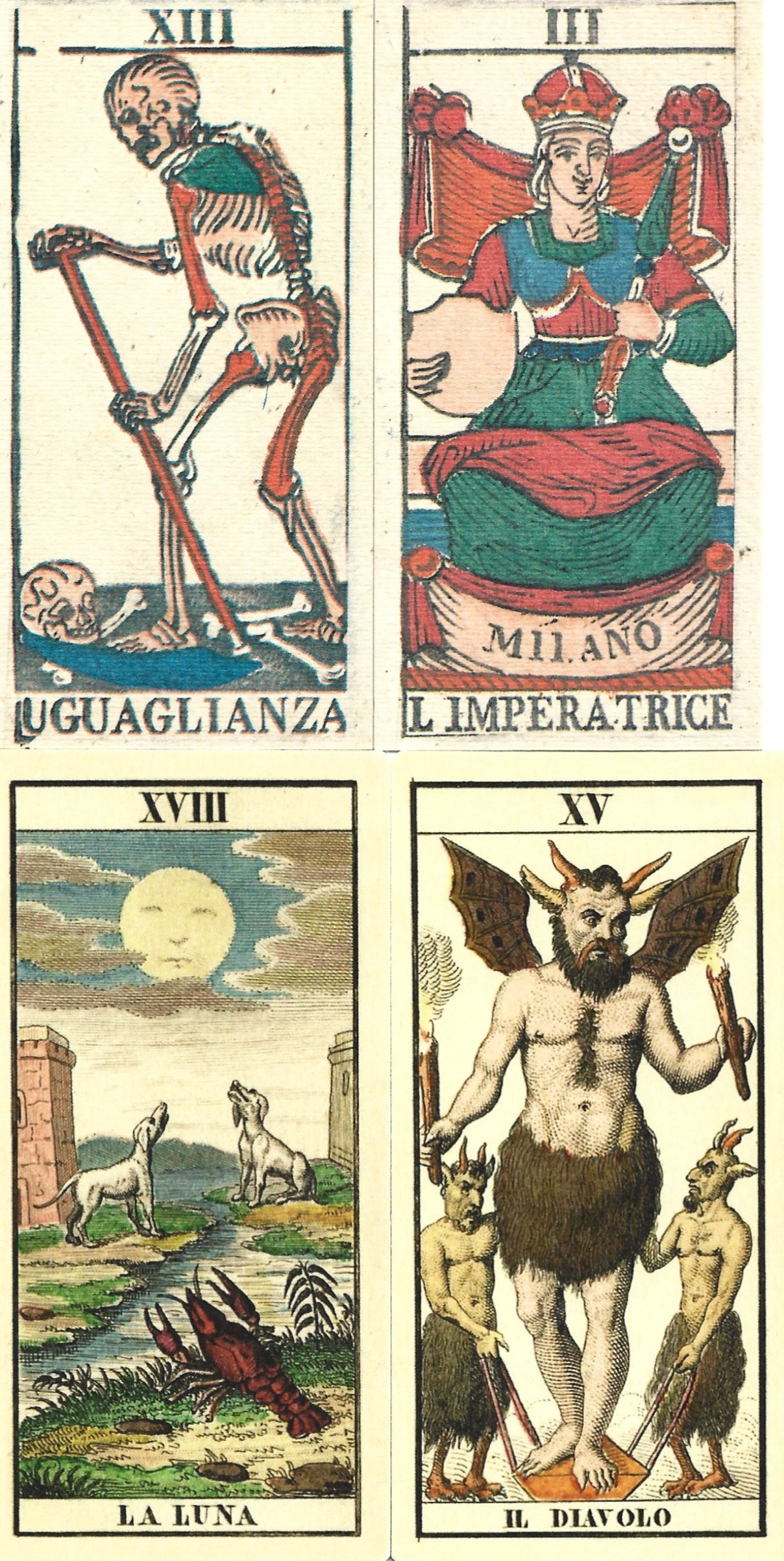
The Soprafino Moon card on the left has the same components as the Tarot de Marseille card on the right: the moon, two dogs, two towers, a body of water and a crustacean. But the scene, set near an estuary, is rendered in realistic detail. Towers and boats in the distance give depth to the scene. Inexplicably, a boiled lobster on a silver platter dominates the foreground. Nearly all Milanese card makers discarded this image and made a version of the TdM. The Dotti workshop, which I’ll discuss in detail below, created an elegant compromise. The distance is flattened somewhat, and the dogs and towers are more symmetrical, but not as stiff as the TdM. The water meanders into the distance rather than being confined to a basin. The lobster has been freed from his platter and seems rather animated. (Edoardo Dotti, 1862, reprinted by Giordano Berti).
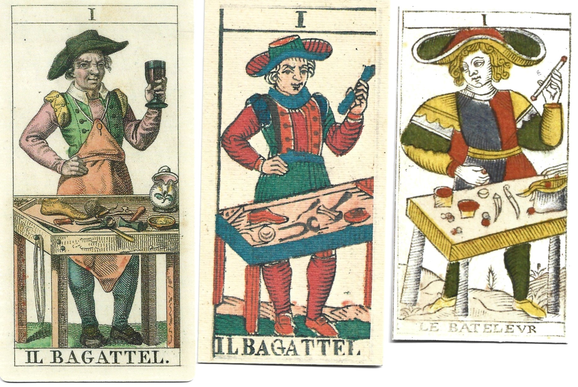
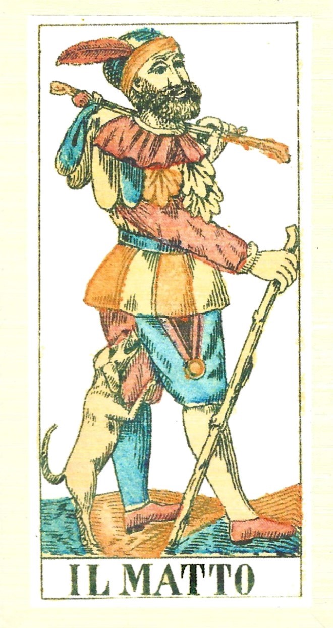
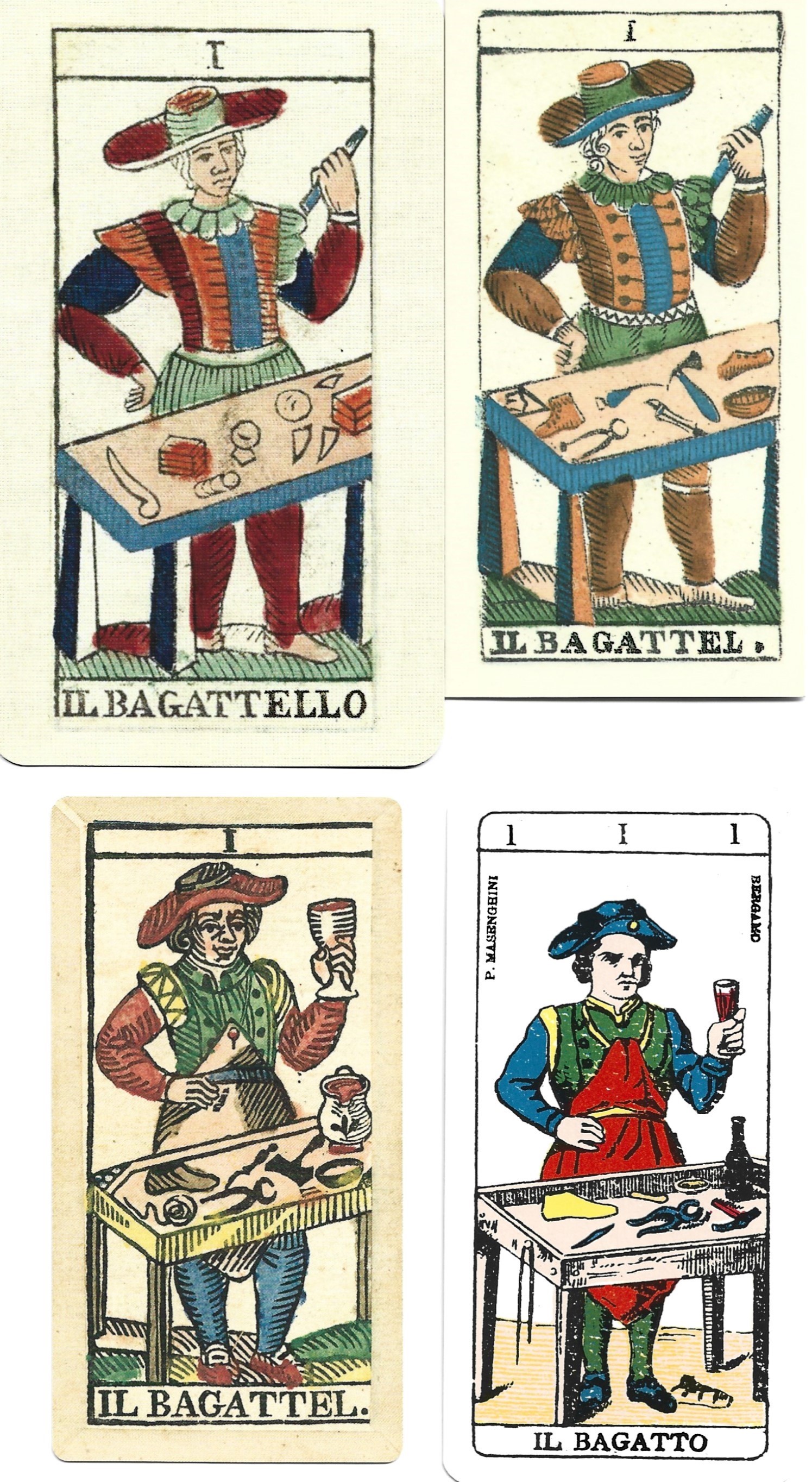
The Soprafino Bagatto is a craftsman in a leather apron standing in front of his work bench which is strewn with cobbler’s tools. He’s hoisting a wine glass and has a jug on the table. If he’s not a shoemaker who drinks on the job, he might be the remnant of a lost tradition that depicted the lowest trump card as an innkeeper.
On the right, the traditional TdM trickster wields his baton in front of a table scattered with magician’s tools. The image on the middle card was used by nearly all Milanese card makers. The Bagatto has lost his wine glass and jug, and wields a magician’s baton. He’s dressed like the TdM magician, but he retains the cobbler’s tools on his table. A quick way to determine if a deck is Milanese is to check the Bagatto’s table. If you see cobbler’s tools, you know the deck was influenced by the Soprafino. (Center card is a facsimile by Il Meneghello of a wood block Milanese deck by the Dotti workshop).

The Soprafino Devil sits among flames and writhing green monsters. He looks horrified as he shakes his fist at something beyond the card’s border. This is a complete contrast to the TdM devil standing stiffly on a podium with his two minions. As with the Moon card, most Milanese card makers tossed out the Soprafino image and went with something more familiar. Rather than the French Tarot de Marseille Devil, they adopted the Devil in furry pants from Piedmont decks, which was later picked up by the printers of Besançon (Jupiter/Juno) cards. The center card is from a woodblock deck that’s a mixture of TdM and Soprafino imagery, printed by Gumppenberg shortly after he published his luxurious Soprafino deck. As an astute businessman, he published a wide range of cards, from exquisitely beautiful and expensive novelty decks, to simple block printed decks that appealed to the average card player. (This deck is a Gumppenberg facsimile by Il Meneghello, 1995).

For years, I wondered if the Soprafino Devil, writhing in flames with green monsters, was original to the Gumppenberg/Dellarocca deck. Once I learned a little more about tarot, I discovered two precedents, both from different cities and previous centuries.
The larger card is from a one-of-a-kind luxury deck commissioned by Count Bentivoglio of Bologna about 1660. This card is a reprint of Mitellli’s copper engraving by Marco Benedetti with his signature hand-folded borders. The Devil in the eighteenth-century Minchiate Fiorentine deck wears the flames like a skirt, while the monsters have morphed into a belt of green snakes. (Facsimile by Il Meneghello. 1986).
The Next Generation
After Gumppenberg’s death in the mid-1840s, two lineages descended directly from his factory. Gumppenberg’s son-in-law, Lamperti, inherited the factory; while a former employee or partner, Dotti, set up his own print shop to make decks in the Gumppenberg style.
Dotti
Teodoro Dotti, a former Gumppenberg employee, struck out on his own and set up a print shop in the 1840s. For forty years, Teodoro and his son, Edoardo, were among the most important card makers of Milan. They redesigned Gumppenberg’s Soprafino to be less baroque and more refined. Edoardo continued to use his father’s engraved plates while changing the colors, maintaining a distinctive Dotti style.
The top cards are by T. Dotti, 1845 (facsimile by Il Meneghello, 1985). The bottom cards are by E. Dotti, 1862 (printed by Giordano Berti, 2021).
Dotti’s tarot decks are classic Milanese. They derive from the Soprafino, but many of the images shift toward the Tarot de Marseille. The Devil with furry pants, and the modified Moon card shown here, are typical of the Dotti workshop. Their Grim Reaper sweeps up bones rather than symbols of human vanity. The Empress’s empty shield shows how politics affected card design. After Austria was booted out of Italy, it was politically incorrect to display any reminders of the Hapsburg dynasty or the Austrian tyranny. The Hapsburg eagle was removed from the shields of the Empress and Emperor.
Edoardo inherited his father’s workshop about 1860 and ran it until 1882 when it was acquired by E. Colombo & Co. The company, and the production of Milanese decks, faded out in the early twentieth century.
From Lamperti to Bordoni
Gumppenberg’s son-in-law, Lattanzio Lamperti, inherited the workshop about 1847 and continued with Gumppenberg’s line of cards until it was acquired by P. Negri in 1862. In 1885 Bordoni acquired the company. He hired artists to redraw Gumppenberg’s most popular decks and rendered them in copper engraving and wood block. Like most Milanese card makers, the company faded out by the early twentieth century.
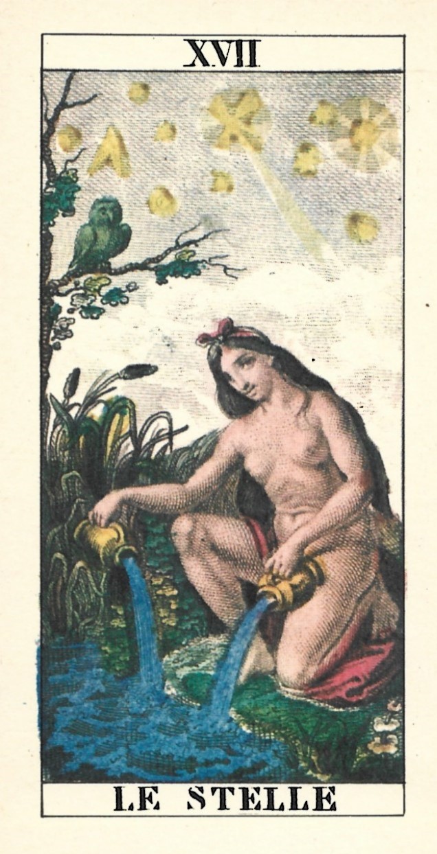
Bordoni’s tarot decks were revived by Vito Arienti when he established the Il Solleone publishing company near Milan in 1969. During the 1970s and 1980s, he focused on printing facsimiles of nineteenth-century decks, including many by Bordoni. On the left is the Star card from Gumppenberg’s original Soprafino deck reprinted by Il Solleone in 1981 using dark, intense colors. The company has closed, but their Milanese decks can still be found online. Osvaldo Menegazzi worked with Arienti until he left to establish his Il Meneghello line of cards that includes a variety of Milanese facsimiles printed in the 1980s and 1990s.
The most recent Bordoni revival is an 1885 Milanese-style deck published by Marco Benedetti in 2025 (shown on left). The deck is printed from wood blocks that are so finely carved they look like copper engraving. A distinctive feature of Benedetti’s deck is the bordi rivoltinati, or rivoltini, made by folding backing paper over to the front and gluing it down. This labor-intensive technique was a feature of all Italian decks until the late nineteenth-century. As far as I know, Benedetti is the only card maker who produces decks with this technique. Feeling these silky cards slide through your hands, and listening to them whisper as they’re shuffled, is an experience you don’t get with any other deck.
Other Milanese Printers
Numerous print shops, besides the ones discussed above, printed Milanese style decks that combined soprafino and Tarot de Marseille imagery in varying proportions. I’ve provided a comparison of four Bagatto cards to show the variety.
The deck on the upper left was created by Giuseppe and Felice Rossi sometime between 1825 and 1840. It’s listed on Gamecrafter as F. Di Milano by Nova Mundi, and is a typical Milanese blend of Soprafino and Tarot de Marseille. This Bagatto has all the characteristics of the French card, except, as in all Milanese decks, his head is tilted in the opposite direction.
On the upper right we see a facsimile by Il Meneghello of a typical Milanese card printed by Gumppenberg about 1840. This wood block deck was intended for the average card player. The Bagatto is a blend of the two styles: a stage Magician holding a wand, but with cobbler’s tools on his table.
On the lower left we see the Tarocchi Piacentini, a deck from Lo Scarabeo’s Anima Antiqua series. Originally printed in Piacenza in 1876, the imagery stays close to Dellarocca’s Soprafino deck, but was rendered in somewhat crude wood block carving. The Bagatto is a typical Soprafino type with leather apron, cobbler’s tools, and a raised wine glass.
The playing card company Masenghini reprinted their late nineteenth-century deck of simple wood cut cards that were intended for the average game player. The cards follow the Soprafino pattern closely. The pips are stripped down, with minimal ornamentation to make the deck more affordable. The deck comes with a booklet in Italian giving detailed instructions for divination.
Piedmont Soprafino
A craze for elaborate and fanciful tarot decks swept through mid-nineteenth-century Piedmont. Giordano Berti discovered and printed several of these ornate decks. Two shown here were directly inspired by the Soprafino deck.
Upper left is the Fleury Corband Tarocchi, printed in Turin in 1847. Berti has reproduced the twenty-two trump cards with updated colors. These wood block cards follow the Soprafino pattern closely, except for the Moon and Sun cards which are slightly modified.
Next to Corband we find the Tarocchi Claudio Perrin, printed in Turin in 1865, using the new technology of chromolithography. Most of the cards are based on the Soprafino, but on a few cards, the artist’s personality breaks free. The Fool is a prancing court jester, and the Bagatto is a cobbler sitting at his workbench. The Devil is immersed in flames along with two semi-human creatures that hang onto his legs.
The Avondo Brothers’ large printing plant dominated the town of Serravalle throughout the eighteenth and nineteenth centuries. The bottom two cards are from their 1880 deck that’s marketed by Lo Scarabeo as the Ancient Italian Tarot. The trumps are a faithful copy of the Soprafino deck rendered in wood carving, which gives the cards a more robust energy. The abundant vegetation and ornamentation on the pips gives each card a distinct personality. This deck is my favorite for reading because each card has a unique voice. The Ace of cups is unique to this deck. A cherub sits in a doorway cut into an elaborate chalice while four dolphins lend stability to the base. The Masenghini deck described above is one of the few that copied the Avondo Ace.
Playing Cards

There must be many double-headed Soprafino decks out there, but I only have two in my collection. On the left is the Tarot Genovese, printed in 1887 by Fratelli Armanino. It’s a close copy of the Avondo Brothers version of Dellarocca’s engravings. Next to it is a reprint of Masenghini’s late 19th century simplified woodblock deck which combines Tarot de Marseile and Soprafino imagery.
Additional Information
Suggestions for starting a collection
Here’s my suggestion for a collection that covers the range of Milanese styles. Contact information for the publishers is below.
- Facsimile of the original Dellarocca Soprafino: Lo Scarabeo’s Anima Antiqua deck is the best and comes with a multi-lingual booklet with historical information.
- A close copy of the original Soprafino with minimal TdM influence: Treat yourself to the luxurious Bordoni reprint by Marco Benedetti. The Piacentini or Avondo Brothers decks also fit this category.
- Dotti: Tarocchi Edoardo Dotti 1862 by Giordano Berti. It’s accompanied by a 58-page book stuffed with historical facts about Milanese tarot and illustrated with numerous color plates.
- Hybrid Soprafino and Tarot de Marseille: The Rossi deck listed on Gamecrafter as F. Di Milano by Nova Mundi. A typical Gamecrafter deck with large borders and rounded corners. If you want a more authentic experience, try Il Meneghello’s Gioco di Tarocchi 1850. It’s a facsimile of a woodblock deck printed by Dotti with a very different look and feel from the copper engraved Dotti recommended in #3.
Where to Obtain Milanese Decks
Marco Benedetti: See all his historic decks on his facebook page:
https://www.facebook.com/Marco.C.Benedetti.Tarot
Order a deck by emailing him at: Benedetti.Tarot@gmail.com
Giordano Berti: https://rinascimentoitalianartenglish.wordpress.com/catalog/
Lo Scarabeo’s Anima Antiqua series: Llewellyn is the distributor of Lo Scarabeo decks for North America: https://www.llewellyn.com/browse_category.php?product_category_id=232
Il Meneghello: They don’t have an online shop, you have to email them. Their facebook page with contact information: https://www.facebook.com/search/top?q=il%20meneghello
Tarot Garden: Their “Featured Collectibles” section often has Il Solleone, Il Meneghello and other hard to find historic decks: https://tarotgarden.com/featured-collectibles/?page=1
Where to Read More
Links to related deck reviews and articles in this blog:
The Soprafino Deck of Carlo Della Rocca: Deeper background history and details on Gumppenberg, Dotti, the Avondo Brothers; and more cards to see, especially pip cards.
https://tarot-heritage.com/2011/10/26/the-soprafino-deck-of-carlo-dellarocca/
The Three Soprafinos: Compares decks by Il Solleone, Il Meneghello, and Lo Scarabeo.
https://tarot-heritage.com/2015/10/09/the-three-soprafinos/
Review of the Edoardo Dotti Tarot produced by Giordano Berti.
https://tarot-heritage.com/2021/05/11/edoardo-dotti-tarot-published-by-giordano-berti/
Review of the Fleury Corband Tarot produced by Giordano Berti.
https://tarot-heritage.com/2020/07/15/tarocchi-corband-produced-by-giordano-berti/
Review of the Tarocchi Perrin deck produced by Giordano Berti.
https://tarot-heritage.com/2016/06/06/tarocchi-perrin-1865/
Other Resources Online:
IPCS Pattern Sheet Milanese
https://i-p-c-s.org/pattern/ps-5.html
Lombardy Pattern Sheet
Andy’s Playing Cards – The Tarot And Other Early Cards – page II – Regional Tarots
This short article on Gumppenberg shows some of his playing cards.
https://www.wopc.co.uk/italy/gumppenberg/
Books
The Encyclopedia of Tarot, Volume II, pp. 358-378, Stuart Kaplan. Most of the decks I’ve mentioned in this article, plus many more, can be found on these pages.
The Milanese Tarot from XVI to XX Century, Giordano Berti, 2021. This is the 58-page booklet that accompanies his Edoardo Dotti deck. Much valuable information plus color illustrations.


Thanks for the article! I would like to point out that the Death is cleaning all BUT the artist palette! it’s just left out toward the viewer, I always assumed that the DellaRocca left a nod that all the temporal things are vain, but art remains. this is best viewed on the Solleone, where the art tool are in dark orange and the perspective is more clear
Great observation! The artist’s palette is separated out and sits prominently up front. I never noticed that. Thanks for pointing out the significance. I heartily agree — art is worth more than all the material junk the Grim Reaper is sweeping up.