The Visconti Sforza Tarocchi by U. S. Games
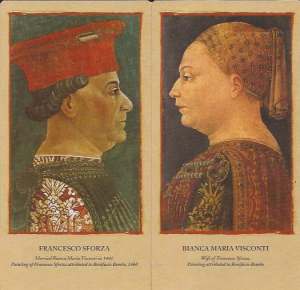
U.S. Games Systems has just reissued their facsimile of the Pierpont Morgan Bergamo Visconti Sforza Tarocchi, originally produced in 1975 and still in print. They’ve added bonus cards with portraits of the Duke and Duchess of Milan, probably by Bonifacio Bembo, who most likely created the original deck in the 1450s. Both editions are the same size as the original cards: 3.5 x 7.0 inches. Let’s compare the two decks.
- Overall, the newer deck has lighter tones, which better approximates the shimmering gold backgrounds of the original cards. In the older deck, the background and the gold embellishments seem nearly brown. The gold on the sword tips and the cups in the newer deck almost shines.
- The 1975 deck shows the original cream border that extends beyond the blue inner border. In the new deck this border has been obliterated and merged into the tan edge. It gives a cleaner appearance but loses authenticity.
- The colors of the foreground figures are not as deep as in the 1975 deck. There’s a loss of richness, and the cards appear a bit washed out.
- Since the colors are lighter, the red smears where the clay matrix bled through the gold leaf are more obvious.
- Much to my dismay, the newer deck retains the same psychedelic and anachronistic Devil and Tower cards as the older deck. These two cards have darker tones than in the 1975 deck.
- The newer deck improves on the Knight of Coins replacement card. Using the Knight of Cups as a template, they flipped the figure horizontally, put a coin in his hand and gave him the same robes as the other three coins court cards.
- The backs of the older deck are solid dark red. In the newer deck they’re red-brown with subtle streaks and tan spots to give the illusion the paint has worn off. The nail holes show through to the back, giving a more authentic feel.
 The deck comes in a sturdy fliptop box. The enclosed booklet is essentially the same as the 1975 edition, except it’s printed on sturdier paper and the illustrations are in color. The booklet contains charts with card titles in three languages, plus several variant names for many cards. There’s a history of the Visconti and Sforza families, and a discussion of the heraldic devices that appear on the cards, along with a chart giving the location of all known handpainted cards. In the short discussion on who painted the cards, the booklet goes along with the general consensus that Bonifacio Bembo produced the cards; but some of his contemporaries have their promoters. The upright and reversed divinatory meanings for each card owe much to the Waite Smith tradition. The booklet ends with the inevitable Celtic Cross.
Dal Negro also produced a facsimile deck that’s the same size as the U. S. Games decks. There’s no date, but I believe it was produced in the 1970s or 80s. There are subtle differences in coloring. The gold in the dal Negro deck is lighter than the U. S. Games 1975 version but not as light as the 2015 deck. The colors on the foreground figures are slightly richer, which helps the details stand out. The background on the pip cards is white rather than tan, so the floral decoration pops out. Cards that were originally highlighted with silver leaf, such as the robes on some court cards, are shiny rather than dull dark gray as in both U. S. Games decks. The Devil and Tower are in the same anachronistic Tarot de Marseille style as the U. S. Games decks, but the colors are not as lurid.
Bottom line: I probably own every version of the Visconti Sforza deck ever published. If I had to get rid of all of them except one or two, I would keep the Dal Negro deck for studying, along with Volume II of the Kaplan’s Encyclopedia, which has a huge amount of information on the deck and the Visconti and Sforza families. For shuffling and reading, I prefer Lo Scarabeo’s gold foil deck. It has those awful wide borders with the card names in fifty languages, but the borders are more subtle than in many of their decks so I can live with it; and I love the sparkliness.
Get the deck here at USGamesinc.com


Reblogged this on Bonnie Cehovet and commented:
For those that love the ancient Tarots – this blog is for you!
I dearly love the ancient Tarots, and really liked that you included the Encyclopedia of Tarot reference. Your blogs are in depth, and a true blessing!
Bonnie, thank you so much for your lovely words. Your encouragement is much appreciated.
weird a lot you find the Dal Negro goods for that price! Very thin just plastic low definition for 57€ its a robbery!🫤
I agree. There are so many versions of this deck around. I wouldn’t recommend US Games first. Here’s an article I did on the replacement Devil and Tower cards where you get an overview of the decks available. I didn’t go into card stock, just the style of the replacement cards.