Comparing Visconti Sforza Replacement Cards: The Devil’s in the Details
If you can only own one or two Visconti Sforza decks, before purchasing you need to familiarize yourself with the replacement cards – Tower, Devil and Knight of Coins. (The Three of Swords is also replaced, but it’s hard to mess that one up.)
There are at least eleven versions of the Pierpont Morgan Bergamo Visconti Sforza Tarocchi (to use its official name) by six different publishers. It comes in two basic flavors: a photo-reproduction of the cards as they exist now with chipped paint, flaking gold and nail holes top center; or a restored version that’s been touched up to look like new. Some decks are the original size (3.5 x 7 inches), while some are smaller. The images in all decks are identical except the four lost cards. Every publisher hires an artist to create replacements, which vary greatly and can make or break a deck.
I want to see replacement cards that look like they belong in an International Gothic deck from about 1450. I don’t want to see a Devil and Tower patterned on the Tarot de Marseille which emerged over 200 years later. There is no precedent in early Italian decks for a devil on a dais with two minions, or people falling from a tower. The four court figures in each suit wear robes with the same fabric. The clothing in the suit of Coins has interlocking six-sided rings forming a dark blue honeycomb on a gray-blue background. There’s no excuse for a Knight of Coins dressed differently than the others in his suit; yet only two decks manage to come close to getting it right.
I’ve scanned the Devil and Tower from six decks in my collection and arranged them in order from my most to least favorite. I’ll discuss them in that order, and give a critique of the Knight of Coins.
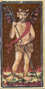
 Il Meneghello produced an original size deck in 1996 and an identical smaller deck (2.25 x 4.5 inches) in 2002. The replacement cards by Giovanni Scarsato look like they belong in a late medieval deck. The Devil has an extra set of ass’s ears, bat wings and a furry skirt, all common attributes of a medieval devil. The Tower resembles other early cards except for the anachronistic falling person. The Knight of Coins is dressed in plain blue fabric, and unique to this deck, he’s wearing armor. Extra points for having the best horse of any deck.
 Lo Scarabeo has produced more versions of this deck than any other publisher. The best is their gold foil deck from 1995 that measures 2.3 x 4.5 inches and is printed with foil incised to resemble the original embossing. Atanas A. Atanassov did the restoration and the replacement cards. These cards glitter and shine like the originals, but unfortunately the scans come out dark bronze. The Devil and Tower were modeled on the Rothschild sheet, one of the earliest examples of Italian decks, so it gets high marks for historical accuracy. Inexplicably, the Knight of Coins is dressed in the same gold fabric as the cups court cards. Lo Scarabeo produces a mini deck (1.75 x 3.25 inches) with the same replacement cards but without the gold foil.
Around 2002 Lo Scarabeo printed another version without the gold foil and with different replacement cards which I believe closely resemble the Tarot de Marseille (I don’t have the deck in front of me to be certain).
 The third set of illustrations is another Lo Scarabeo gold foil deck. The 22 Grand Trumps is 3.0 x 5.5 inches, not quite as large as the original. There’s no indication who the artist is, but it might be Atanassov. The replacement cards are modeled on the Tarot de Marseille, and although the artist has attempted to give them a medieval look, it just doesn’t come off.
In 1975 both Dal Negro and US Games/Grafica Gutenberg printed identical photo-reproduction decks in their original size. The Devil and Tower blend nicely with the rest of the deck but  unfortunately are closely modeled on the Tarot de Marseille. The Knight of Coins was created by flipping the Knight of Cups so he faces the other direction, then substituting a coin for the cup, so the Knight is dressed like the cups suit rather than the suit he belongs to.
The Golden Tarot published by Race Point, with a book written by Mary Packard, is slightly smaller than original (3.25 x 6.5 inches) and is restored. Both replacement cards are heavy on the red-orange, patterned on the Tarot de Marseille, and look totally out of place in a medieval deck. The Knight’s cloak has the interlocking ring pattern, but the background is gold instead of blue-gray.
US Games/AG Muller reprinted the 1975 photo-reproduction deck in 1984, 2007 and 2015. All three printings have this same lurid, cringe-worthy replacement cards by Luigi Scapini. But the Knight of Coins is the most historically correct since his cloak has the correct pattern and colors, although a bit too bright.
Two decks not shown here:
Monumenta Longobardia printed the earliest reproduction in 1974. The replacement cards are line d rawings based closely on the Tarot de Marseille. Only 500 copies were printed.
In 2012, Alice Cooper expressed her love for this deck by painting a faithful copy with replacement cards based on the Tarot de Marseille. She printed 200 copies that sell on Etsy.
Here’s my opinion in a nutshell:
- Best Devil: Il Meneghello with the Lo Scarabeo 1995 gold a close runner up.
- Best Tower: a tie between the same two decks as above. They both have drawbacks.
- Best Knight of Coins: US Games 1984/2007/2015.
- Best overall: Il Meneghello.
Links to other articles on the Visconti Sforza deck:
- Background History on the deck and its times
- Review of Race Point Golden Tarot
- Review of Alice Cooper’s hand painted deck
- Review of US Games 2015 deck
- Review of Il Meneghello
- A personal visit with the VS deck in New York
- The deck’s fate after it left Sforza hands


Hi Sherryl, Thanks for your review of the replacement cards of the Visconti Sforza deck. As you say yourself, none of the existing decks passes all tests for historical accuracy. I disagree with you in two things. You say that it is hard to mess up the Three of Swords. Look closer to the Three of Swords of the Il Meneghello deck and you will see that it is not impossible. The text on the banner is appearing upside down. Then you say there are no early Italian decks with people falling down the Tower. Look at the Bolognese Rothschild sheet dated to the early 16th Century to see the oldest deck with falling people. Thanks again for this great review. Maybe this will push the card makers to make a near perfect deck.
Thanks so much for your comments, Iolon. I didn’t look at the 3 of Swords in my decks before writing the article. Laziness doesn’t pay. Who would have thought that Menegazzi of all people would make such a mistake!
I wonder if the Tower design in the Bolognese deck came from France or if it’s a remnant of an old Italian tradition? The more I learn about the decks of Bologna (mostly from you) the more intriguing they become.
Let me add a tiny footnote to this wonderful reference page (what would we do without you, Sherryl!) My take on the Meneghello 3 of Swords is that they chose to do it with the central sword pointing down, like the ace – so any critique should focus on that, not the banner 🙂
Thanks for your comment Alba. Now I’m a bit confused. I just laid out the swords cards from the Il Meneghello facsimile published in 2002, and another facsimile by Dal Negro probably published about the same time. In all the cards, all the vertical swords have their points facing up. The only card with the sword facing downward is the Ace. Is there an older facsimile where the 3 of Swords has a vertical sword pointing down? Maybe we were looking at that back in 2017. From what I can see right now, there is no problem. All vertical swords point upward, and all written text on the ribbons is oriented correctly. Do you have a deck that shows things differently?
Yes, my Meneghello is from 1996 (though I bought it later) and it matches Ionon’s comment. Not sure if the picture will be visible to you through this link: https://share.icloud.com/photos/0a6t2AwLwN7QVw_RefLxcFJ2g
Yes, I was able to see your photo, and it taught me something shocking. I wish I could show you the side-by-side images I have of your 1996 three of swords and mine from 2002. But it looks like I can’t post any photos unless they have a URL. It seems that someone at Il Meneghello decided it was wrong to have the sword pointing down in the 1996 three of swords. In 2002 they corrected it by altering the five of swords. They grayed out two of the crossed swords, which are still there, very obvious, and looking like ghosts. The vines enclosing the flowers curl in the same direction as the five of swords, but this is mirror image to the original three of swords in your deck. I can’t believe someone decided that the original card maker didn’t know what he was doing and they needed to correct him 500 years later. My card looks like a real mess – I wish I had your deck.
I’m so glad you commented on this article, I never would’ve known about the alteration if you hadn’t.
Fascinating! I may have to grill Cristina about it when I drop by 😃
The U.S. Games Systems version is my personal favorite because The Devil truly looks like a medieval depiction of the devil, whereas the other versions are too humanoid and therefore anachronistic. The familiar satyr image that we’ve come to associate with the devil is actually a relatively modern invention. In fact, if you look at illustrations from the Middle Ages, he always bears a much more draconic appearance.
I agree. I want my Devil to look medieval – no little figures chained at the bottom. My all-time favorite Devils are in the Vandenborre and Vievil decks.
I know this is an old post but am currently reading all I can find on Visconti decks and have a question.
Do you know if there was more than one edition of the 1996 Il Meneghello? I have just got a 1996 edition but sadly no LWB so no further info (or deck number, but I don’t mind as I just wanted the cards!) And I have seen people saying online that the Il Meneghello versions don’t have foiling but some earlier ones do have shiny metallic printer’s inks for the gold and silver. But I’ve seen other people saying they are dull, like the current edition, and not shiny at all. Mine is shiny and really beautiful. (Mine came in a little sort of handmade folder thing, dated 1996 and with the Knight of Wands on the front, FWIW).
My question – is there more than one 1996 edition? And if so, what are the differences/are they different to eachother?
Thanks!
My 1996 deck came in a rigid, gray box with the Knight of Batons on the cover. I’ve recently passed this deck on to someone else, so I can’t look at it and double check, but I’m quite sure there was no foil or shiny ink, it was entirely matte. Since your deck was packaged so differently, it seems there may have been two different printings, which I’m not aware of. I suggest you join the Tarot history Facebook group and ask about it there. If you aren’t familiar with this group, it’s full of very knowledgeable and helpful people, and I’m sure someone will have an answer for you.